Learning the basics of CSS in 2022
CSS which stands for Cascading StyleSheets is a language used for declaratively writing styles for HTML elements. We use CSS to add beauty to a website to make it look pleasant and presentable. In this tutorial I shall be introducing you to CSS.
I assume you already have a good knowledge of HTML and how the web works.
Getting Started
You will need a code editor and a browser for this tutorial. If you do not know what a code editor is, check out my [code editor](/blog/code-editor-101) beginners explanation. For this post I shall be using Vs code and the chrome browser.
1. Selecting Elements
The first step to styling any element is selecting it. There are three(3) ways with which we select an element in css:
- Using the tag name
- Using the class name
- Using the Id of the element
Using the tag name
Here, we simply write the name of the element we want to style followed by opening and closing brackets (`{}`). So for example if we wanted to style an <h1> element we would do so as such:
h1{
// styles goes here
}
This selects all h1 elements in the html document. This is useful when you need to apply a generic style to all occurrences of a particular element in your html.
A more practical use of this selector is giving all paragraphs in your document a line-height of 22pt for easy readability. The code for this would look as such:
p {
  line-height: 22pt;
}
This will select all <p> elements in your html and give it a line-height of 22pt.
Using class-names
We can also select elements using their class name which we assign to them in our html. Example :
<!-- html -->
<h2 class="title"></h2>
To select this element in CSS using its class name we write a dot (.) followed by the class:
This will apply the `font-size` to the element(s) with class title which in this case is the <h2>
Using ids
Here we select the element using the id we assigned to it in our html. Example:
<!-- html -->
<h2 id="title"></h2>
To select this element in CSS using its class name we write a hash (#) followed by the id name:
#title {
  font-size: 2rem;
}
This will apply the font-size to the element(s) with id title which in this case is the <h2>
Nesting styles
You can specify the particular element you want in your HTML by selecting it using one of the above methods. But what of for this HTML code:
<div class="card-1">
  <p>lorem ipsum dolor.</p>
</div>
<div class="card-2">
  <p>lorem ipsum dolor.</p>
</div>
We needed .card-1's and .card-2's content( that is, the <p> element) to have different colors? We cannot just write :
p {
  color: red;
}
p {
  color: green;
}
This will still apply the same color to all the <p> in the page. We can solve this by nesting the styles. By nesting I mean when selecting an element we first select its parent then it as such:
/* for classes */
.parent .child {
  /* styles goes here */
}

/* for ids */
#parent #child {
  /* styles goes here */
}

/* for tags */
parent child {
  /* styles goes here */
}

/* We can mix the selectors too */
.parent child {
  /* styles goes here */
}


parent .child {
  /* styles goes here */
}
This allows us to select elements more efficiently in our HTML document tree. So, to solve our problem above we could do as such:
.card-1 p {
  color: red;
}
.card-2 p {
  color: green;
}
This now applies different colors to the content of each card.
2. Using properties to style elements
After selecting an element we will need to style it based on our needs. To achieve this we use some properties which CSS provides us with. These properties are used to style every aspect of an element. Some of the things you can style on an element are:
- The text of the element
- The position of the element
- The appearance(color, height, width, orientation, shadow. Size) of the element
- Animating the element
- Making the element responsive
All these and much more are possible with CSS. We shall not be able to cover all the properties in this one post but I shall explain the very basic ones to help you get started with styling your content. For this, we shall be using this bland html code:
<div class="card">
  <img src="./img.png" alt="" class="card__image" />
  <div class="content">
    <h4 class="subtitle">CODE</h4>
    <h3 class="title">Mystery of the Ringmaster</h3>
    <p class="description">
      Lorem ipsum dolor sit amet consectetur adipisicing elit. Nam optio ipsam
      assumenda.
    </p>
  </div>
</div>
This renders as :
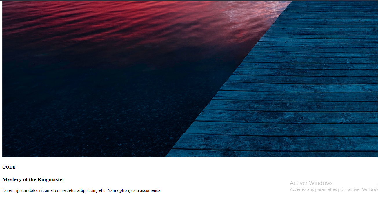
This image contains the basic markup for making a card component. We shall now use CSS to make it look presentable.
Adding general styling
We add some basic styling to the <body> element which encompasses all elements shown in the browser window. Here, we add styling to remover browser defaults like padding and margin and we also change the background color. We also use flexbox to center the element horizontally. To learn more about flexbox, check out my intro to flexbox article.
body {
  margin: 0;
  padding: 0;
  box-sizing: border-box;
  display: flex;
  align-items: center;
  justify-content: center;
  height: 100%;
  background: rgb(248, 248, 248);
}
Colors in CSS can be written in many different formats but the 3 most popular are:
- Hex e.g
#eade12 - rgb: e.g
rgb(12,123,90) - color name: e.g
blue
For more info on using and writing colors check out my using colors in CSS article
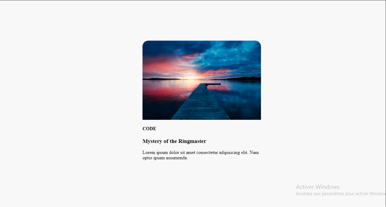
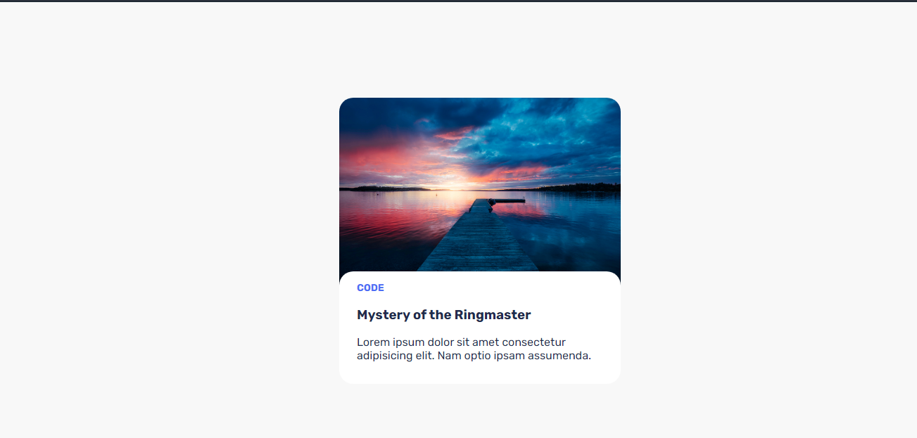
Styling the card wrapper
The card wrapper is the div with class card. We would be adding styling to change the radius of its sides (border-radius), giving a width and setting an overflow: hidden to hide anything that overflows the width of the card. This is especially useful as the image likely does not have the same border-radius as the card and might overflow it.
.card {
  width: 400px;
  margin-top: 10%;
  border-radius: 20px;
  overflow: hidden;
}
Saving this code and running it in the browser gives:
Styling the content wrapper
Content wrapper here refers to the div with class content. We shall be styling its border radius, padding and we shall use the transform : translateY() to move it up a little bit for consistency. We will also add a font-family to change the default font-family to something much more presentable in a card component:
.card .content {
  transition: all 0.3s ease;
  padding: 15px 25px;
  font-family: 'Rubik', sans-serif;
  background: white;
  border-radius: 20px;
  transition-duration: 1350ms;
  color: #212b4d;
  transform: translateY(-20px);
}
The padding: 15px 25px is a shorthand way of writing padding of an element. Padding is the space inside an element that pushes its content towards the center. You can specify padding for all four corners of an element using padding-top, padding-left, padding-right, and padding-bottom respectively. Using padding, we can specify all of this in this format:
element {
  padding: top left right bottom;
}
Specifying only one applies it to all, specifying two applies the first value to the `top` and `bottom` and the second to the `left` and `right`
Hence when we run the code you'll notice the content of the div are not touching its edges.
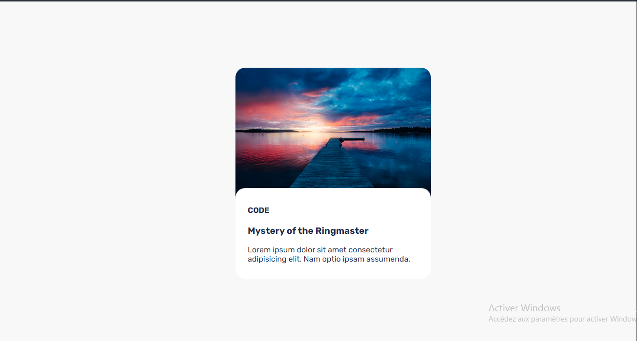
WOW!😍😍 that's looking good! but we are not yet done with it.
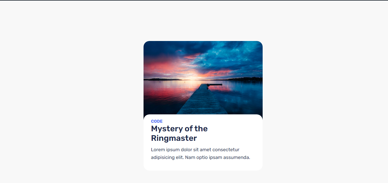
Styling the text
For this we will be styling the `size`, `color, font-family, spacing of the title, subtitle and description of the card.
Subtitle of the card
We start by changing the color and font-size of the subtitle. We will also remove any extra space between it and the title below it as we shall be adding this back on the title. Also, we shall be transforming the text of the subtitle to all-caps using the `text-transform` property.
.card .content .subtitle {
  color: #4c6ef5;
  text-transform: uppercase;
  margin: 0;
  font-size: 14px;
}
This yields:
Styling the description text.
Here we're going to be styling the size and font family of the description of the card.
.card .content .description {
  margin-top: 10px;
  line-height: 20pt;
  font-size: 16px;
}
This renders :
And that's it!! a beautiful card component built with beginner code!😍
Final code
<div class="card">
  <img src="./img.png" alt="" class="card__image" />
  <div class="content">
    <h4 class="subtitle">CODE</h4>
    <h3 class="title">Mystery of the Ringmaster</h3>
    <p class="description">
      Lorem ipsum dolor sit amet consectetur adipisicing elit. Nam optio ipsam
      assumenda.
    </p>
  </div>
</div>body {
margin: 0;
padding: 0;
box-sizing: border-box;
display: flex;
align-items: center;
justify-content: center;
height: 100%;
background: rgb(248, 248, 248);
}
img.card__image {
max-width: 100%;
display: block;
transition: all 0.3s ease;
margin: 0;
}
.card {
width: 400px;
margin-top: 10%;
border-radius: 20px;
overflow: hidden;
transition: all 0.3s ease;
}
.card .content {
transition: all 0.3s ease;
padding: 15px 25px;
font-family: 'Rubik', sans-serif;
background: white;
border-radius: 20px;
transition-duration: 1350ms;
color: #212b4d;
transform: translateY(-20px);
}
.card .content .subtitle {
color: #4c6ef5;
text-transform: uppercase;
margin: 0;
font-size: 14px;
}
.card .content .title {
font-size: 27px;
margin-top: 10px;
margin: 0;
font-weight: 600;
}
.card .content .description {
margin-top: 10px;
line-height: 20pt;
font-size: 16px;
}Conclusion
Alright, this was just a brief introduction to the superpowers CSS gives us. I will be going more in depth of each CSS property in future articles. Hope you guys enjoyed reading as much as I did writing.
See y'all😇😇

Michael Nji author
I build interactive web apps using mordern web technologies
2.6k